


Project scope
Brand & identity, Website design, Catalogue design, Corporate stationery, Notebook design
ABOUT
In 1993, founder Gail Stephens lost her appetite for half-baked industrialised practices and vowed to bake bread the old-fashioned way: by hand, using quality ingredients and time-worn artisanal methods.
The Bread Factory have come a long way since Gail brought a handful of London’s best bakers together. Yet the key ingredients – their ethos, skill and decades-old sourdough starter cultures – still haven’t changed.
Today the Bread Factory is an award-winning bakery who supply baked goods to London's most celebrated chefs, Michelin restaurants and your local cafe.
CHALLENGE
The Bread Factory wanted a brand refresh, hungry for an identity that reflected their evolving vision without losing sight of the original mission – giving people better bread and freshly baked goods.

APPROACH
Given The Bread Factory's established history, we were inspired to visit their Hendon factory.
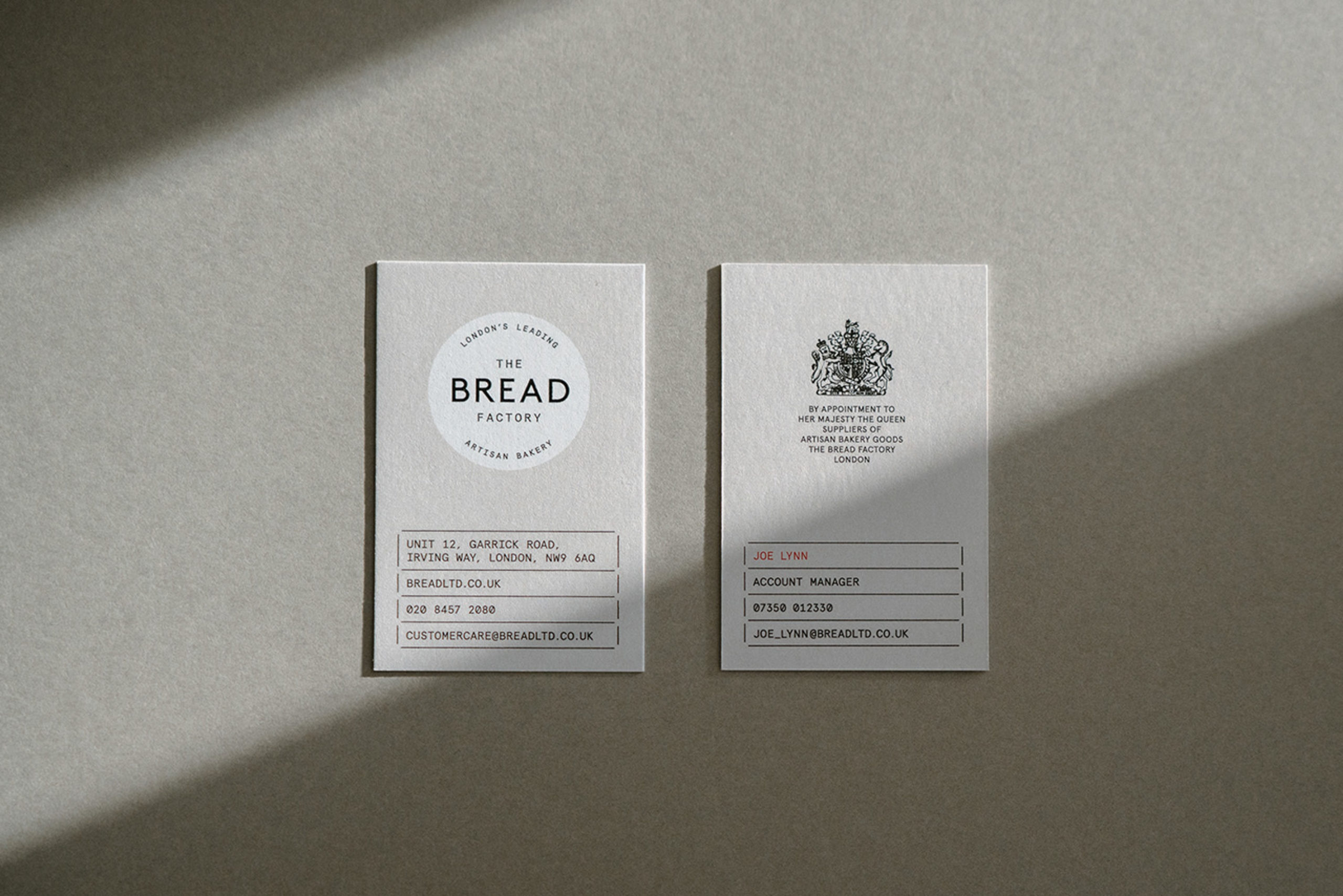
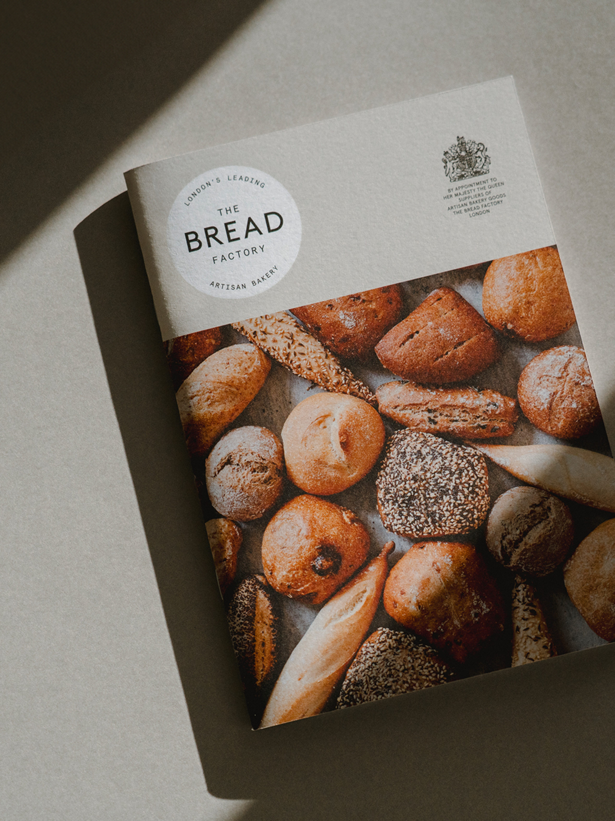
During our pilgrimage we observed stackable containers, neat shelves and labelled crates that inspired a highly efficient and modular approach to the identity. Our design system followed the modular, labelled formula which allowed information to be organised, stacked and separated in columns and rows. Key pieces of information were highlighted in red, inspired by the traditional rubber stamp which mark USE BY dates.
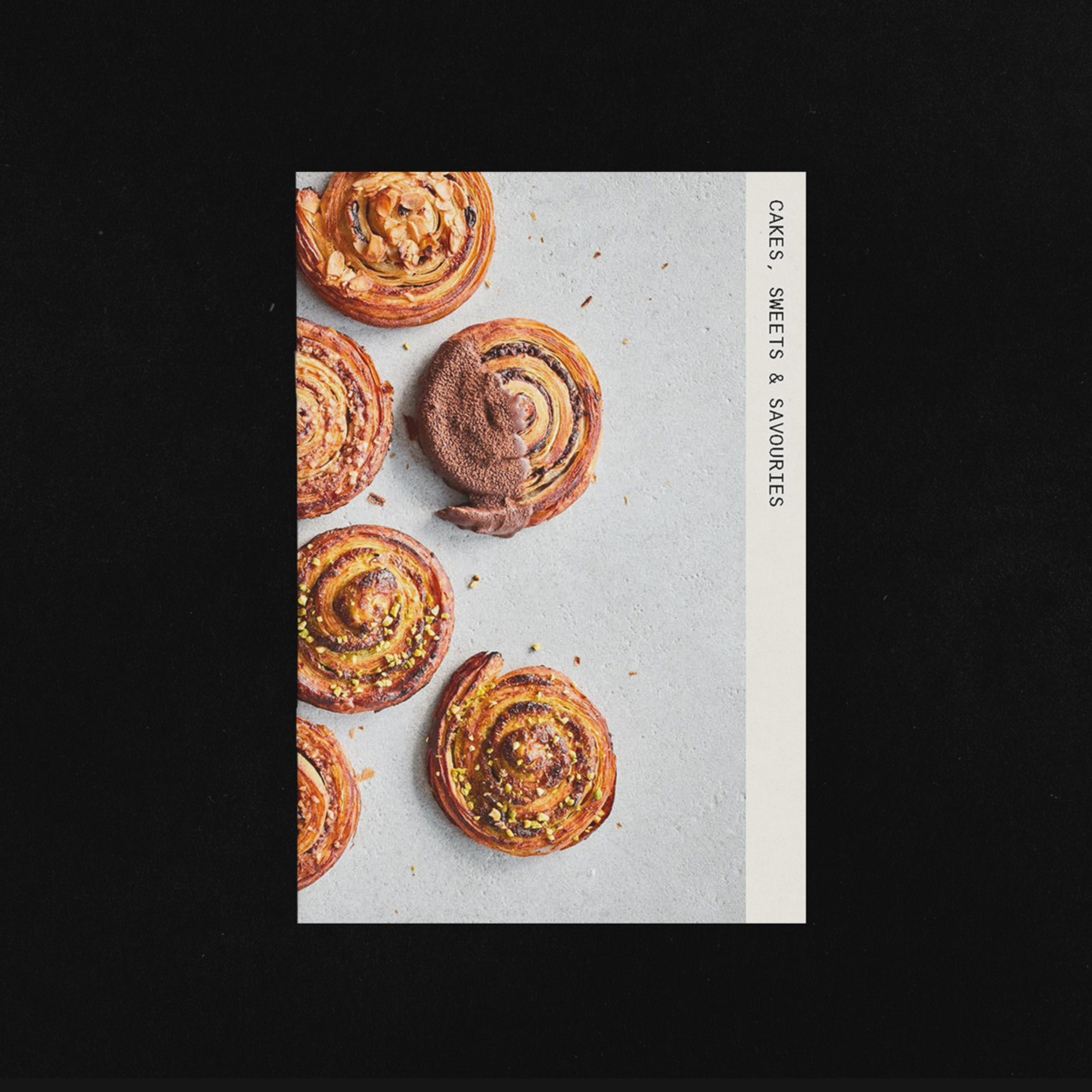
The Bread Factory’s customers preferred making an old-fashioned telephone call to place their order, wielding a well-thumbed product catalogue but the extensive offering was tricky to navigate. Rather than a standard flyer, we created a diary/notebook as a gift for customers and colleagues designed to make life easier (and tastier!) with hero products and last order dates sandwiched between blank pages and pictures of you guessed it, cakes.