

Project scope
Brand & identity, Website design, Stationery design, Packaging design
About
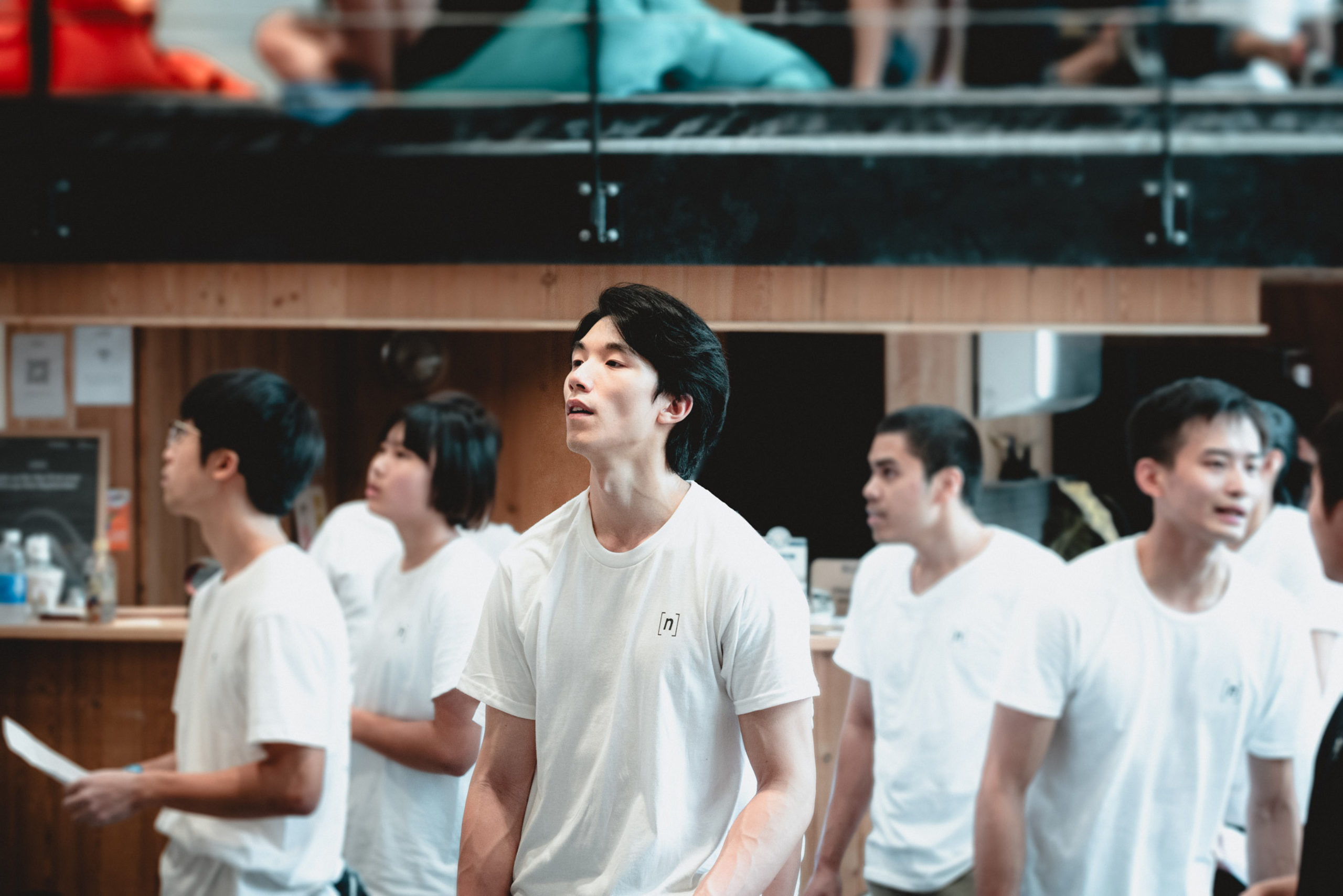
n bouldering is a new kind of climbing experience in the heart of Hong Kong that fosters conversations and skill sharing for seasoned and newbie climbers alike.
THE CHALLENGE
n bouldering wanted a brand identity that embodied the climbing spirit; a fearless rational that embraced problem solving in the face of the unknown. It was vital that the identity appealed to all genders and seasoned climbers as well as those who just wanted to watch, hang out, meet new friends and grab a coffee.
APPROACH
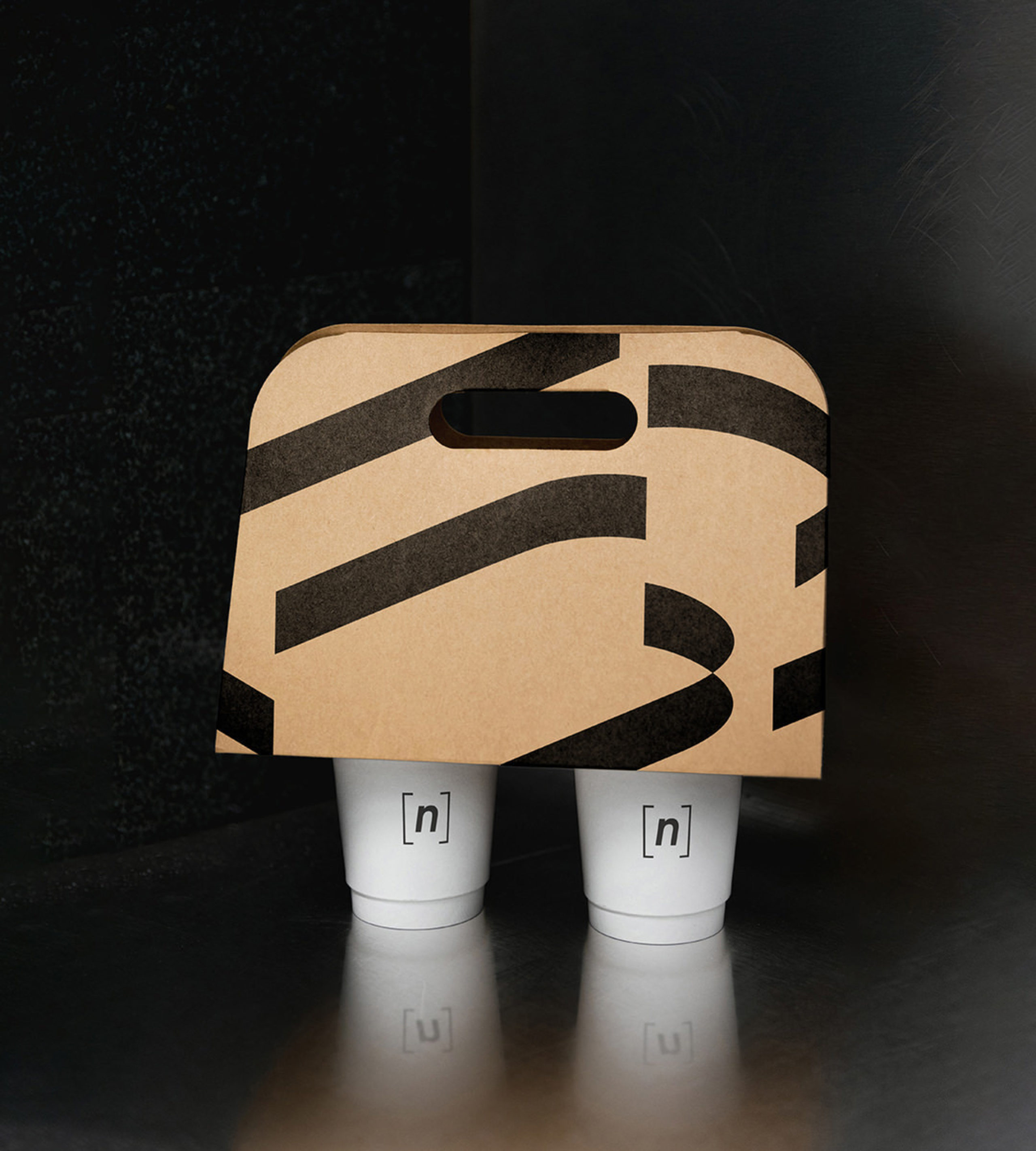
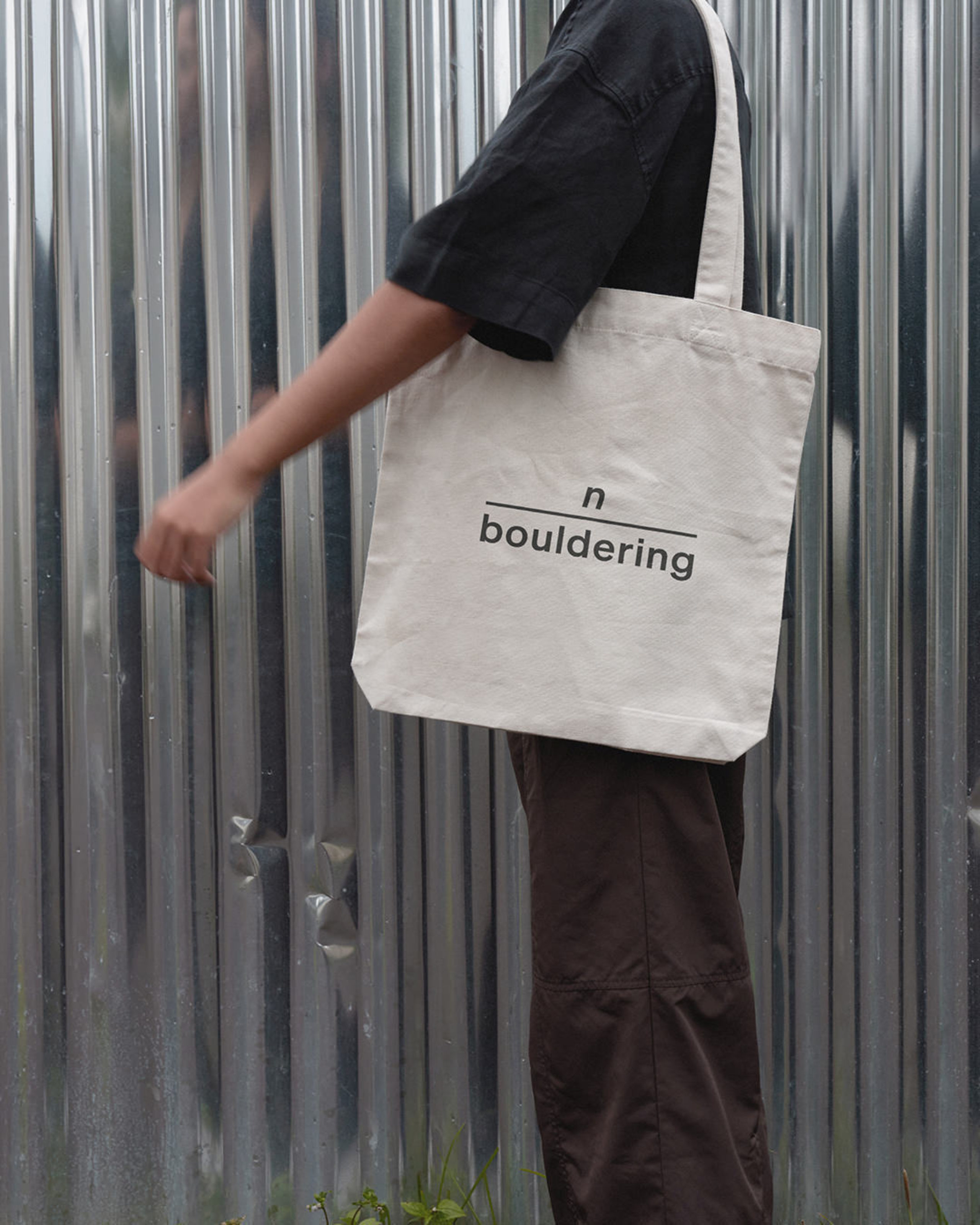
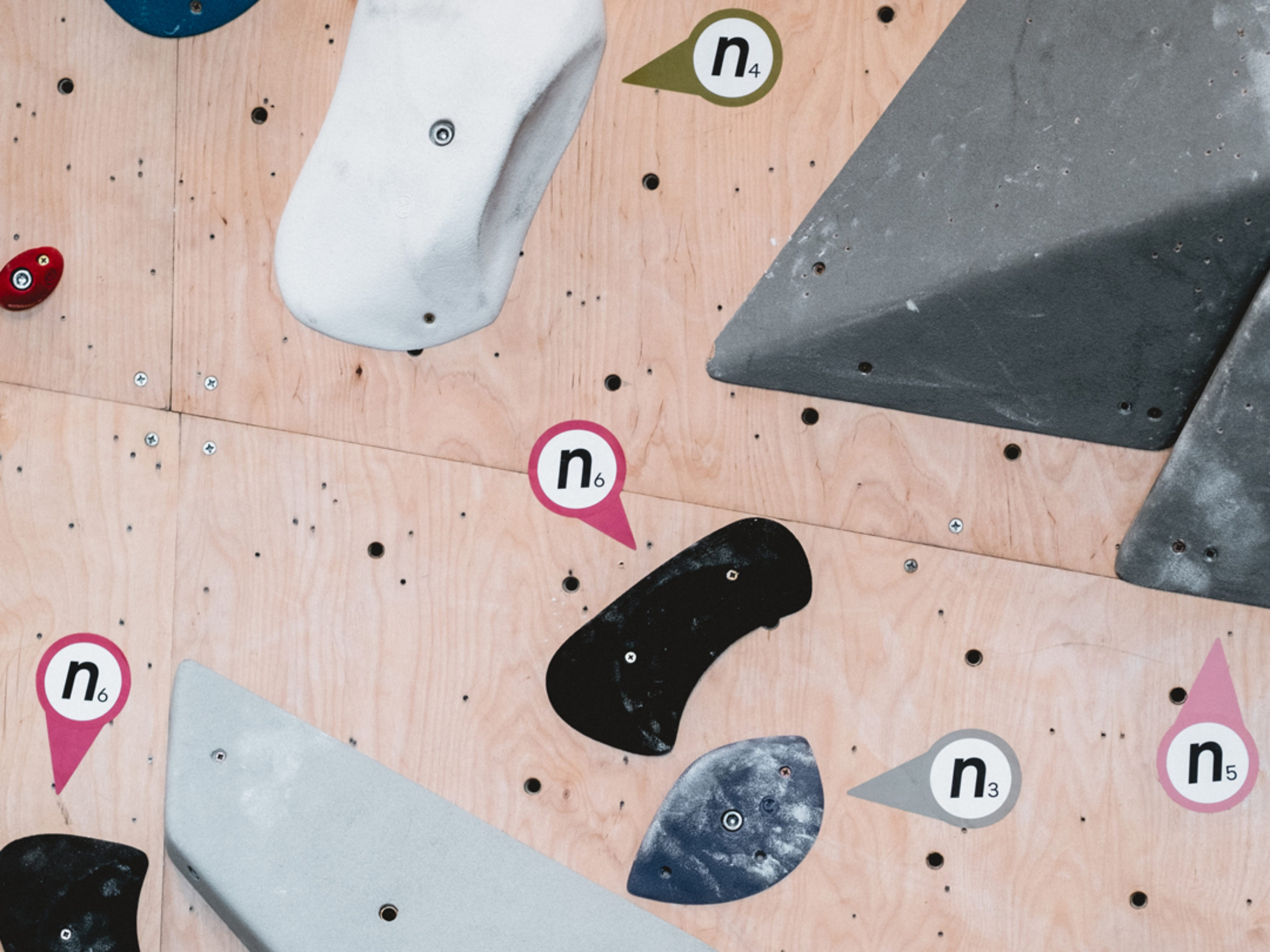
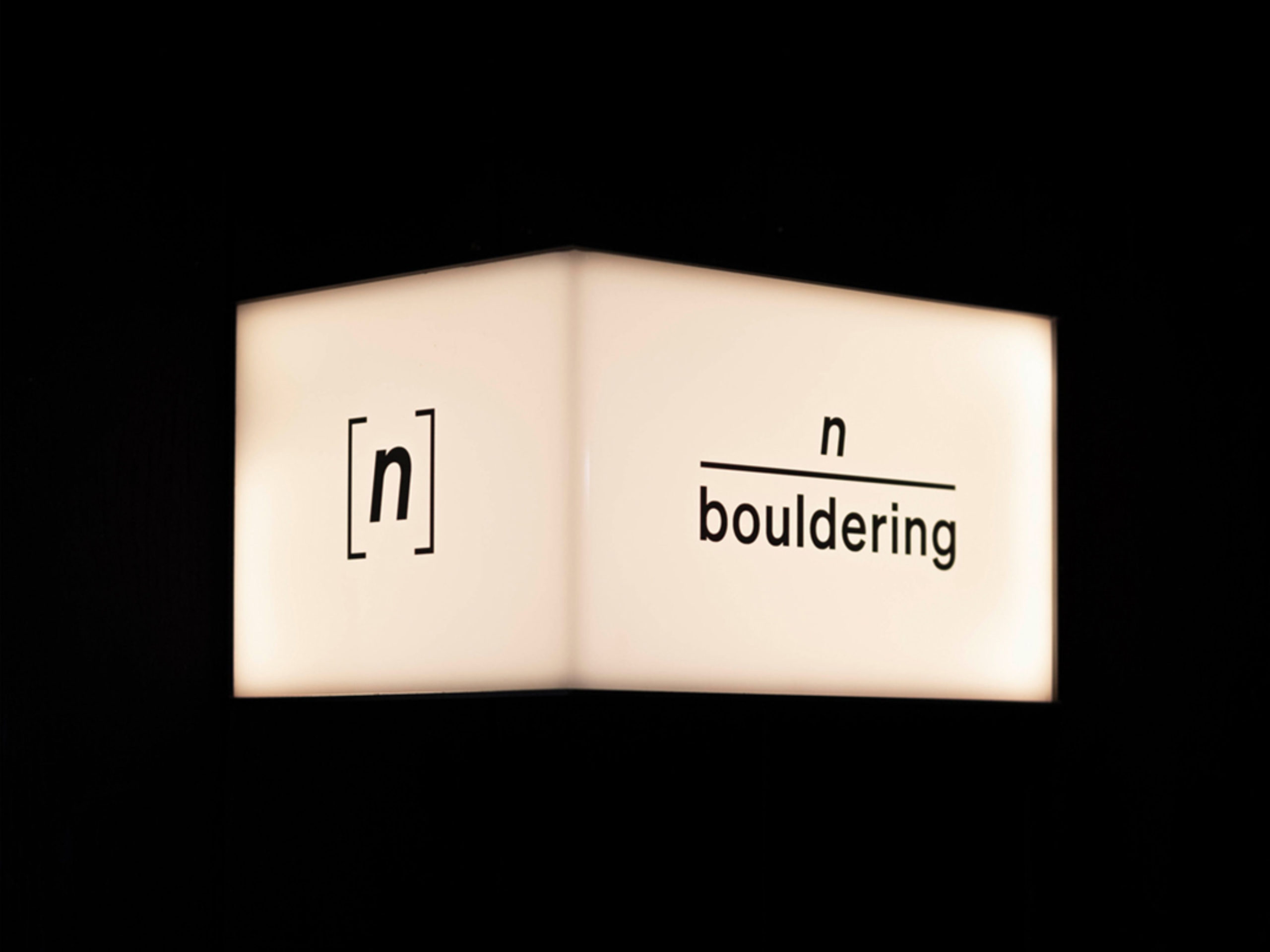
The name n bouldering stemmed from the ‘n’ used for solving math equations and is a metaphor for the many routes that can be taken when deciding on the next steps in life. We used this mathematical formula as the language for the brand and identity; from ‘hang on’ tees to signage and coffee cups.
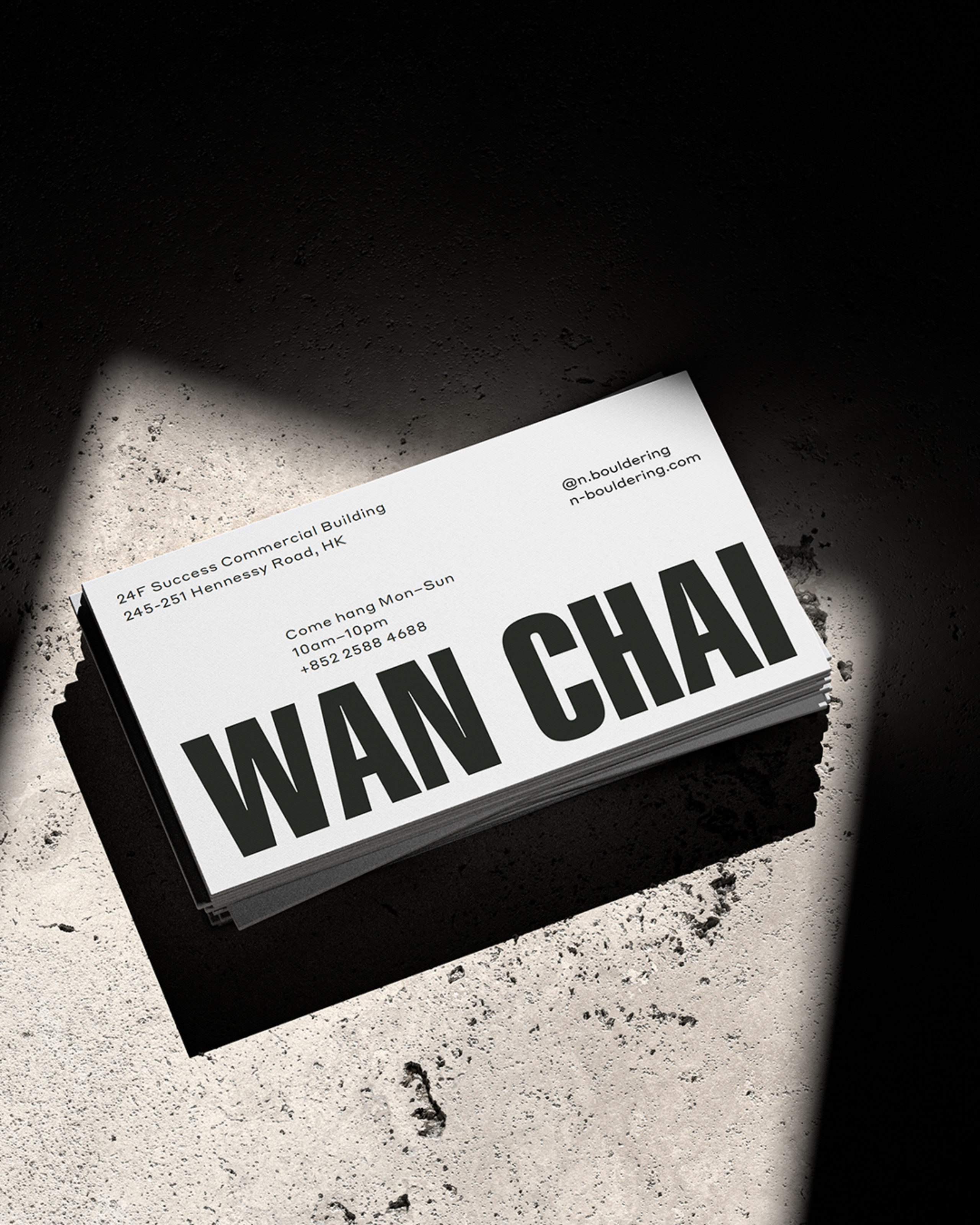
Located on the 24th floor of the Success Commercial Building in Hong Kong, n bouldering boasts sky high views and high vantage points of the city. Inspired by the inverted climb, the art direction for imagery incorporates upside-down and tilted angles to pique curiosity.
Our upside-down viewpoint informed the brand’s tagline and Instagram hashtag #fromanotherpointofview which animated the climbing spirit through a quirky lens that encouraged social media engagement.